Units in CSS
In CSS, units are used to specify the size of various elements, such as font size, margins, paddings, and more. Understanding the different types of units is crucial for creating responsive and scalable designs.
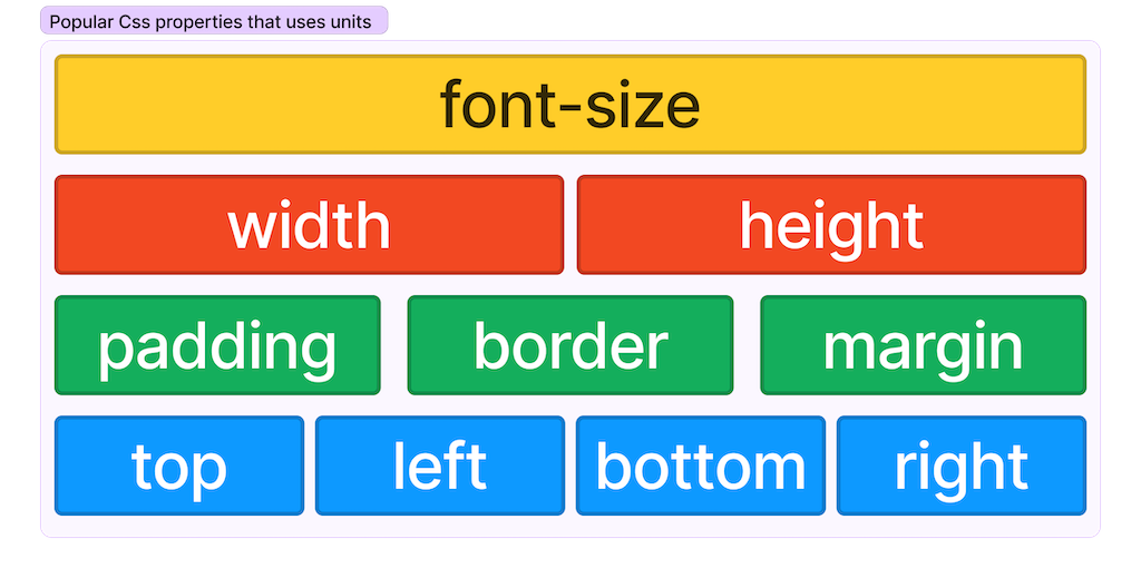
Where do we use?
There are few most frequently used properties where we use units. Based on the unit overall experiance of content in website would change. Below image would demonstrage the list of properties where we mention units.
Absolute Units
-
Pixels (px): The most commonly used unit, but not ideal for responsive designs.
font-size: 16px; -
Points (pt): Mainly used for print media, 1pt is equal to 1/72 of an inch.
font-size: 12pt; -
Inches (in), Centimeters (cm), Millimeters (mm): Rarely used in web design, more relevant for print.
width: 2in;
Relative Units
-
Percent (%): Relative to the parent element's size.
width: 50%; -
Ems (em): Relative to the font size of the element itself or its parent.
padding: 1em; -
Rems (rem): Relative to the root element's font size.
font-size: 1.5rem; -
Viewport Width (vw) and Viewport Height (vh): Relative to the viewport's width and height.
font-size: 4vw; -
Viewport Minimum (vmin) and Viewport Maximum (vmax): Relative to the smaller or larger dimension between vw and vh.
font-size: 4vmin; -
Ex (ex) and Ch (ch): Relative to the x-height and width of the "0" character of the element's font, respectively.
margin: 2ex; -
Fractional Units (fr): Used in CSS Grid to divide the grid into fractional parts.
grid-template-columns: 1fr 2fr;
Best Practices
-
Responsiveness: Use relative units like
%,em,rem,vw,vhfor responsive design. -
Scalability: Use
emandremfor scalable elements, especially text. -
Grid Layout: Use
frunits for flexible and responsive grid layouts. -
Consistency: Stick to a consistent unit system across your project for easier maintenance.
-
Accessibility: Using relative units like
emandremcan make it easier for users to scale text and interface elements. -
Performance: Using viewport units (
vw,vh,vmin,vmax) can sometimes cause performance issues due to frequent resizing. Use them judiciously.
Examples
Responsive Font Size
body {
  font-size: 16px;
}

h1 {
  font-size: 2rem;  /* 32px */
}
Flexible Grid Layout
.grid-container {
  display: grid;
  grid-template-columns: 1fr 2fr;
}
Viewport-based Sizing
.section {
  height: 100vh;  /* Full viewport height */
  width: 50vw;    /* Half viewport width */
}